Kowalski Refresh
Demo build showing a website refresh as a before/after you can actually click through. One fictional Ann Arbor plumbing company, two complete sites: a deliberately dated 2010-era version — cluttered layout, tiny text, no mobile view — and a modern responsive rebuild with clear services, reviews, and calls to action. Both render from the same business data, and a comparison page plus hash-based routes let you flip between them or link straight to either version. Built as the tune-up pitch: this is what the same business looks like after a refresh.
Full case study: Building the 'before' on purpose: a website refresh you can flip throughread →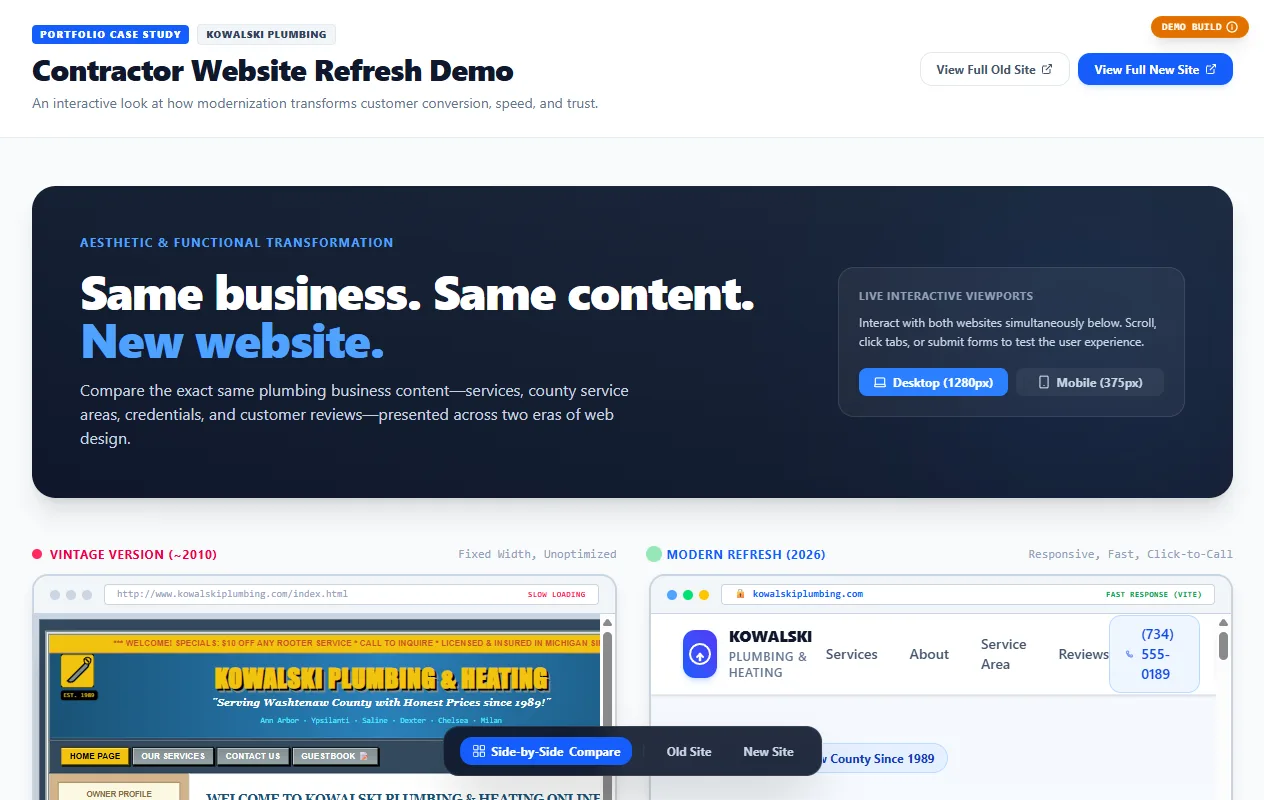
01 — PROBLEM
"Your site looks dated" is easy to say and hard to show. Owners can't picture what a refresh buys them until they see their own kind of site done both ways.
02 — APPROACH
Built both versions of the same fictional plumbing company — a deliberately dated 2010-era site and a modern responsive rebuild — driven by the same business data, with a comparison view and hash routes so each version is directly linkable.
03 — OUTCOME
A demo build that makes the refresh pitch visual: flip between old and new for the same business and the argument makes itself. Labeled as a fictional business throughout.